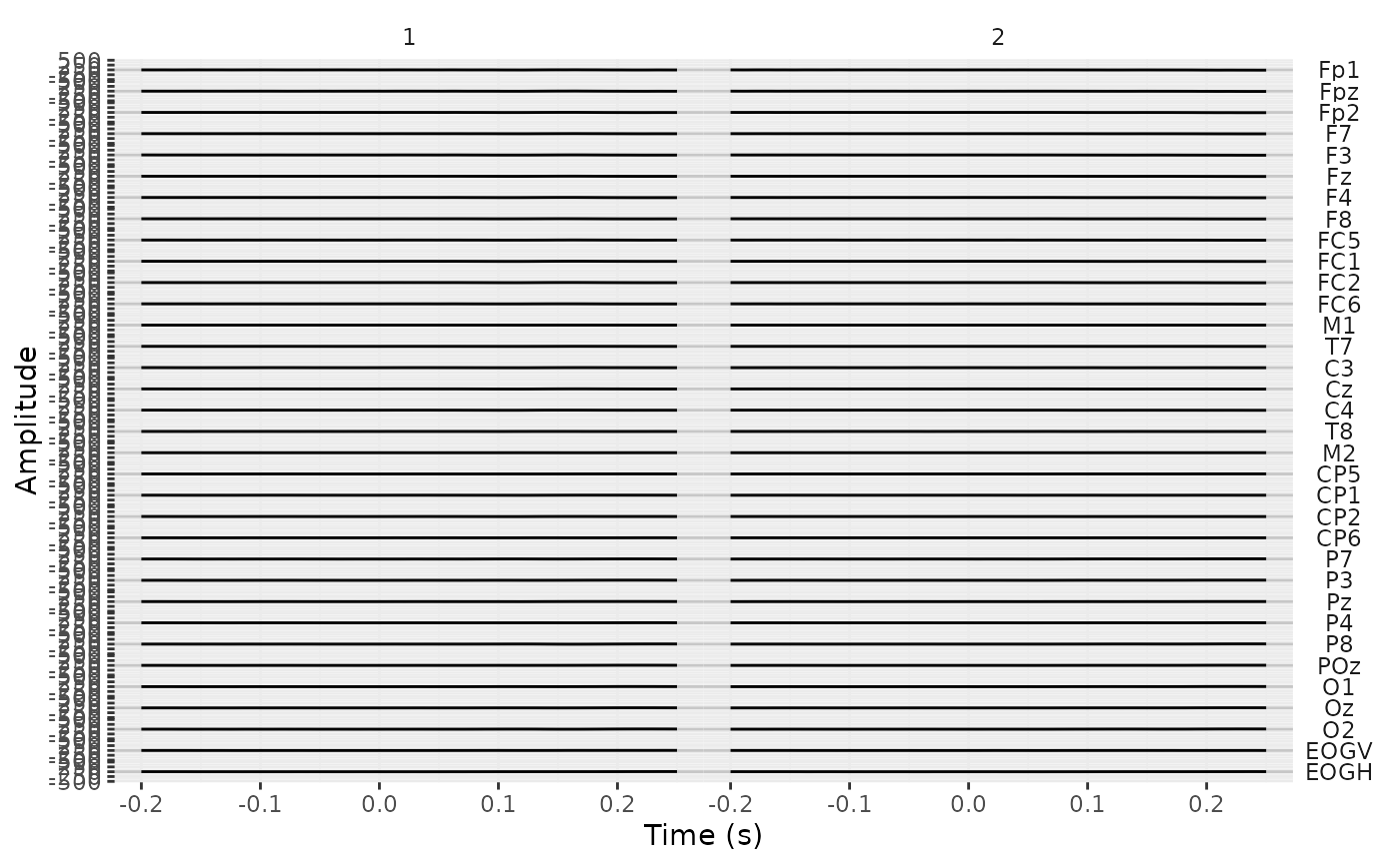
plot creates a ggplot object in which the EEG signal over the whole
recording is plotted by electrode. Useful as a quick visual check for major
noise issues in the recording.
Arguments
- x
An
eeg_lstobject.- .max_sample
Downsample to approximately 6400 samples by default.
- ...
Not in use.
Value
A ggplot object
Details
Note that for normal-size datasets, the plot may take some time to compile.
If necessary, plot will first downsample the eeg_lst object so that there is a
maximum of 6,400 samples. The eeg_lst object is then converted to a long-format
tibble via as_tibble. In this tibble, the .key variable is the
channel/component name and .value its respective amplitude. The sample
number (.sample in the eeg_lst object) is automatically converted to seconds
to create the variable time. By default, time is then plotted on the
x-axis and amplitude on the y-axis, and uses scales = "free"; see ggplot2::facet_grid().
To add additional components to the plot such as titles and annotations, simply
use the + symbol and add layers exactly as you would for ggplot2::ggplot.
See also
Other plotting functions:
annotate_electrodes(),
annotate_events(),
annotate_head(),
eeg_downsample(),
ggplot.eeg_lst(),
plot_components(),
plot_in_layout(),
plot_topo(),
theme_eeguana()